A logo is a visual representation of a brand and its services or products. It should be easy for customers to recognize when seeing it in print or when encountering the business in question.
Think of it as a flag for your business. In the same way that countries use flags to clearly identify each other in international settings, your logo clearly identifies you in a crowded business environment.
Table of Contents
Five characteristics of a perfect logo
It should be unique. In the same way that no pair of countries have the same flag, your logo should be a one of a kind.
It should be versatile. Some complex logos look OK on a web page but don’t render well onto hard media like paper, plastic or cloth. Also, any decent logo should still be a decent logo even if its viewed in simple black and white. Examples here are Apple, McDonalds and Mercedes. All of them are simple designs. You can put them anywhere.


It should be scalable. Does your logo contain small print that is unreadable at low screen resolutions? If it does, that’s going to be a problem. Your logo should be clean and readable whether it’s viewed on a mobile phone screen or on a billboard.
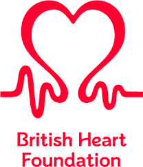
It should be meaningful. Either the name of your company or even better the nature of your business. Web users are in a hurry. A picture, as the expression goes, can say a thousand words. Organizations that do this are Volkswagon (a “v” on top of a “w” in a circle), Mitsubishi (“mitsu” means 3 in Japanese and “bishi” is a derivative of “hishi” meaning diamond shape ie. 3 arranged diamonds) and the British Heart Foundation (could it be any clearer what their mission is all about?)


It should be memorable. An unusual name (Yahoo!), a humorous image (Hogs Breath Cafe), cleverly used colors (multicolored Google logo), intentionally misspelled words (Toys R Us) or a stylish font (Coca Cola) can all be tactics to help your logo stick in your customers’ minds.


Teacherpreneur Marketing
ACADEMY
FACEBOOK GROUP
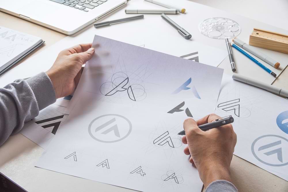
Steps to create a great logo
Brainstorm your ideal client. Think about their goals, needs, and pain points. Consider their gender, age, location, and other relevant details. What words do you think best describe the values which would resonate with them? Imagine different ways you could represent your business name in a way that appeals to your target audience.
Decide on a color palette. Different colors can generate different emotional responses. So pick colors that are consistent with your design objective. And remember that your website, business cards, brochures and other branded materials will need to use colors that match your logo. So choose carefully.
Decide on a font. Just like colors, fonts can communicate different emotions. Choose fonts that are compatible with the type of image you want your brand to project. Google has a number of display fonts which you can choose for free, to add some personality to your logo.
Decide on a logo mark (your logo icon). A logo is a visual representation of your brand, so why tell people what you do if you could just show them? Use simple icons to communicate who you are. Generally, the simpler the idea, the better. It just needs to capture some core aspect of your brand. A logo mark that can be cropped into a square dimension image is always advantageous (see below).
Decide on a tag line (optional). Sometimes a tag line or a slogan communicates the essence of a brand e.g. Nike – “Just do it“, Apple – “Think different” or L’Oreal – “Because you’re worth it“.
Experiment with layout and spacing. Is it best to place your logo mark to the left or above your logo type? Should the tag line go above or below the logo type? How should things be aligned? Think about the different mediums where your logo needs to be represented and design accordingly.
For most people, a rectangular logo will work best on the website. A good rule of thumb would be to create a logo that can be scaled to 250 pixels wide by 150 pixels tall.
Experiment with letter casing. There is some new research which suggests that uppercase lettering can be perceived as having more “masculine” quality vs lowercase which has a more “feminine” tone. Try different combinations of all uppercase, all lowercase, mixed case etc. Try different combinations for your main logo and for the tag line, if you are using one.
Download a variety of formats. You should definitely make sure you have your logo files in a vector format. This is a file type that can be scaled using a tool like Adobe Illustrator (paid) or InkScape (free) without losing any image resolution. Typical vector file types include EPS, PDF and SVG. If you only have JPEG or PNG formats they will look fuzzy and unprofessional when you make them larger.
The opposite of vector file format is raster file format. This includes JPEG (or JPG), PNG, GIF and WEBP. You’ll usually need your logo in raster file format to include it on your web page. Remember to create some versions with a transparent background (PNG format is best) so that you can include your logo with a variety of background colors.
It would also be worth creating a “grayscale” version (black, white, gray) for some environments.
Finally, don’t forget to create a square dimension version as well. You will need this for your “favicon” (the little image in your browser tab) and it’s also useful for a lot of social media profile widgets.
Where to get a logo
There are a couple of different ways to obtain your logo.
Hire somebody. You can easily find a graphic designer on Upwork.com or Fiverr.com. You should be able to hire a skilled professional to create something original for less than $US 100. When you are engaging with a freelancer, be sure to specify how many concept variations they will deliver AND how many concept revisions are included for the price.
Create it yourself. There are a number of “logo generator” programs which are available either for free or at a low cost for those on a budget. You may be limited with your choice of logo mark graphics but this can be a good option for anyone who just needs something simple to get their brand launched.
Conclusion
A logo is an important identification symbol for any business, large or small. Without a logo, the business doesn’t have much of a face. The logo can help to create a unique and memorable representation of the brand. It also helps people to easily identify your service from others, and says something about what you do and for whom.
A well crafted logo also helps establish credibility and project the brand as a serious and competent entity. On the other hand, a poorly designed logo (or none at all) can convey the opposite message.
The author of this post lives in Japan with his wife and family. He has taught English part-time (online and off) for more than a decade. He is passionate about WordPress consulting, online marketing and using the power of the internet to help people achieve their dreams.
He thinks that until you’ve tried sashimi tuna with wasabi, soy sauce, hot sake and a cold beer chaser, you just haven’t lived.


